
I am a logic person. When I build something I sink into features and substance, and I forget about design. The problem? Design is what sells. I have seen plenty of excellent apps that people opened once, felt something was uncomfortable or not polished enough, and said goodbye.
The app in question
I have a task app I built out of personal need. I had tried all kinds of ways to remind myself of things, and nothing stuck. So I built exactly what I needed: a notification you cannot dismiss. It pops every X minutes until you mark the task done. Period. Turns out this helps other people too, so I put it in the store.
And people actually use it. But in my eyes it was seriously ugly. This week I decided to sit on the design.
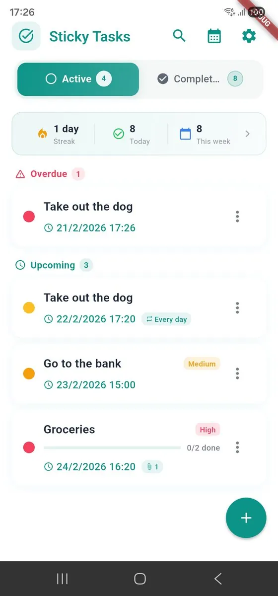
What was the prompt?
I took Claude and told it one sentence: I want the app to be as beautiful and pleasant as the top apps in the store.
Not a sophisticated prompt. One sentence.
What happened next?
From there it took command. It asked me a few questions and produced an HTML mockup of the main screen, then asked me to say what I liked. From there, refinement after refinement. Each round it sharpened a bit more based on my feedback, until we reached something I was genuinely happy with.
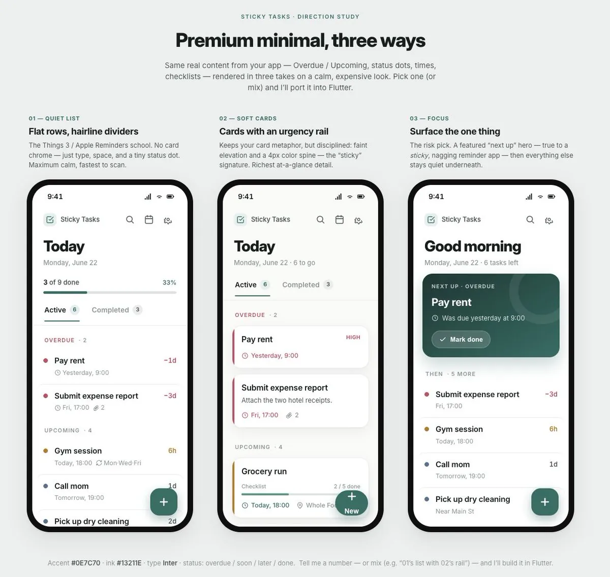
Then I sent it to apply the design to the app. It understood on its own that there was a dark mode that needed handling. I did not ask. It just did it, and added a toggle at the top.
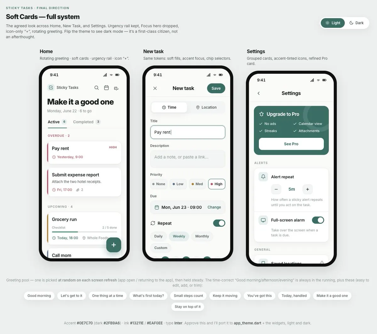
I did not manage the process. It managed the process. My job was reduced to taste: saying what I liked, every round.
The lesson
You do not need the perfect prompt. You need to let the model lead the discovery, and give sharp feedback at every step. That is all.
This maps to something I see constantly in app development work: the bottleneck for a functional product is almost never the features, it is whether people enjoy touching it. If design is not your native skill, the discovery-led loop above is the cheapest way I know to close that gap. It also generalizes past design: on anything where you know what you like but not how to specify it, let the model propose, and you judge.
FAQ
Do I need a detailed prompt to get good design from AI?
No. I gave Claude one sentence: I want the app to feel as pleasant as the top apps in the store. It asked its own questions, produced an HTML mockup of the main screen, and asked what I liked. The skill is not prompt engineering; it is giving sharp feedback at each round.
What surprised you about letting the model lead?
It managed the process, not me. After we converged on a design I liked, I sent it to apply the design in the app and it understood on its own that dark mode existed and needed handling, then added a toggle. I never asked for either.